Photography composition basics
rules of composition explained
how to frame your photos for the best results
In this photography composition tutorial we are going to explore the basics concepts that will guide the emerging photographer to understand the definition, applicability of the elements in a photograph. we are going to touch the definition, principles, and practical guide on how to use the composition to tell a story and to create better photos. We are going to explore various examples and make comments on each image , so you should be able to feel in control of your camera and results after exploring in detail what is all about
A good photograph is not only just a click and an image record, but also is a tool to convey a message, tell a story, a felling that is visually interesting but have also substance. You need to understand what you see in order to create
Before we go into the detail we need to understand what makes us humans vibrate and what do we like to see. First of all our subconscious brains tells us to like what we know, what is familiar. Knowing and understanding means comfort, peace and that leads us to like what we see. Unknown creates fear, danger, hazard, and the lead to mental discomfort and leads us to dislike what we see. We need to really understand this concept to move forward
Familiar, known = mental comfort = the feeling we like something, pleasure, attractiveness
unfamiliar, unknown = mental discomfort, fear = we do not like ,
What is beauty?
Beauty is is an visual aesthetic notion of something we consider beautiful and we like it by looking at it. Beauty is coming from familiarity, is something we already know.
Let’s explore beauty by the most common example – the human face
Analysing the image above think about the following:
- how long and how wide is the face
- ratio between the forehead, nose, mouth
- eyes and eyebrows in relation to the other elements
- upper lips and chin
Try to answer these questions:
- would the colour of the skin impact on the beauty?
- would the colour of the eyes change the beauty?
- would the smoothness of the skin change the beauty?
BEAUTY IS RATIO between left and right, up and down, long and short, high and low, wide and narrow. Beaty is based on the principal of familiarity of something we know and we recognise.
Beauty is coming from combining all elements of the face into one image and that lead us to the following important definition and the subject of the current topic
Composition – definition
Composition is the organisation of several elements together into an arrangements based on a rule. The composition is starting with minimum 2 elements and the rule needs to be identifiable.
In the image above, all the branches are randomly arranged which I do not consider a composition. There is no identifiable rule.
1. Symmetry
Symmetry is the most common composition rules, one of the important beauty components and significantly under appreciated in today photography. It is defined by an axis, visible or not, vertical or horizontal
Symmetry means centrality, order, power and authority. Is means direction, importance and influence. left is equal to the right and the central line is the direction leading visually to the most important element in the picture
Churches, public instituions, government buildings, castles are based on symmetry to show power and importance, to show the way and to lead
The symmetry is not only defined by vertical axis, but also horizontal. In the image above the sky and the ocean meet approximately in the middle of the image suggesting that they have equal importance in the image.
2. Rhythm and repetition
As hopefully self explanatory, repetition is having one elements duplicate many times in the same position and with a specific step. Repetition is a basic composition rule and it is liked by our brains as we know what is coming. Even if we do not see all the steps, we have the comfort of prediction and that is why repetitions are a good tool to create a nice and beautiful image.
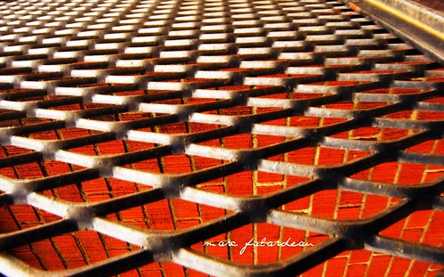
Repetition does not need to be linear. It could be also planar
As a photographer you must always look for fences, poles, and anything to suggest equal steps and this is an easy way to take good photos, interesting to look at. Repetitions are attractive, hence beautiful and if used correctly the eyes of the viewer are directed where they need to be.
Rhythm is the repetition of similar elements or groups of similar elements. This is still e repetition that introduces on element of complexity and tension in the composition. We know a similar element is coming, but we know it is slightly different.
This composition technique is also great to create a sense of perspective to draw our eyes to a specific point in the image. It can be com
Repetition and rhythm are also a music characteristic, which in a way is very similar to all visual arts, and it is based on the same principles. Musical rhythms creating a feeling of pleasure and comfort due to the fact our brains expects and receive the following steps as predicted.
Both rhythm and repetition can be used in isolation or combined with the other composition techniques as per the image above where the symmetry of the fences repetition leads our eyes to the subject – the married couple.
3. Golden Ratio – rule of thirds
Probably most of the photographers already know the rule of thirds were you would split an image horizontally or vertically in 3 sections and place the point of the interest either in the intersection point or on the line defining the thirds. Some cameras come already with guide lines on the LCS screens to help people compose their frames as per the rule of thirds

Not everyone knows in fact the rule of thirds is a simplification of the GOLDEN RATIO
Just in few words, humans have attempted to measure beauty starting with ancient Greece. In that time, mathematicians, artists and philosophers have tried to define beauty and come up with this formula (the history of it is not part of this article)
In an attempt to measure the beauty, it has been discovered that the formula above applies to the human body in so many ways. It is not only the human body but also it is found in nature in animals and flowers. We are surrounded by this magic ratio which is called the golden ratio and is our brains receive this message over and over again, we see perceive this as familiar, common pleasurable and likable. That makes beauty present.

In regards to the human face you would be surprised to discover that all faces we see as beautiful, have the ratio between various elements as described above
we just defined the formula of beauty
Rule of thirds is just s simplified golden ratio formula for the ease of understanding from everyone as the exact number is 1.61803398875. it is easier to tell someone to split an image in 3 equal visual parts rather than draw a line to the ratios as per above formula
One thing to remember:
Golden ratio is the measure of beauty and it is simplified by the rule of thirds. Application of the rule of thirds are infinite and it comes to a great surprise to me how artists (painters, photographers, graphic artists, architects) fail to use it to ensure beauty in their works of art. either they do not know, and choose not to use it to create tension of the unknown, but that comes to risk of being rejected by the viewer.
The golden ration describes the most BEAUTIFUL relation between the long and short, the wide and narrow, the more and less. It can be applied through clear lines or suggestions, colour differences, intensity or time as a different dimension. It can be the relation between the loud and quiet, the light and dark, and other measurements units.
All the principles above apply to music, to food, and to anything that composes elements.Beauty is specific to us a humans and apply to our culture and specie as we have the same natural proportions. If humans would be different, the rule would probably change. We cannot consider beautiful another body that does not follow the same rules and it would be different
Classic image in photography respecting completely the rule of thirds vertically and horizontally in the same time. A safe bet for a classic composition that never fails
Composition characteristics
A. The rule of composition
Going back to the definition of the composition, several elements combined based one a easily recognisable rule is a composition.
In the image above it is very obvious that faces of the family members are creating a vertical line and also symetrical
In the image above, the group is composed based on a circle. Nothing to do with symmetry, rue of thirds but still a valid composition. The rule is obvious, the circle, and we do not have any difficulty in seeing it.
Another variation of the circle with the mother in the middle. This image emphasises the importance of the mother as the central element. This is about the mother surrounded by family and not just a family. this proves the importance arranging the elements of composition in relation with the intended message.
in the image above we can read the faces like a book, from left to right from top to bottom. This is also a classic family tip to have various faces at different levels in the images to enable a logic order to be seen, looked at and analyzed. The image is loosing the balance as there is an empty area on the left side and causing the whole composition to look heavier on the right.
In the image above, it is easy to recognise the zig zag shape of the street and that in itself creates a rule of visual composition leading us to follow the path. This is one very good example that do not follow the classic rule of symmetry, rule of thirds but creates and individual rule how to read this image.
The heart made of stones is the best example that shows how many stones are composed together to form a heart shape. The stones are the compositional elements and the heart shape is the rule. From now, only sky is the limit
Following the above samples we can create an infinite number unique composition based on geometrical shapes, elements, colours or whatever necessary to create a visual appealing image.it does not have to follow the rules as defined by manuals, books or other people, it just need to show a powerful recognisable intention
B. Balance
The sense of balance in an image is just like anything else, the common sense will dictate if the general feeling will be one of still, or tension of objects about to fall over. The balance is important to create a sense of peace for the viewer. that is not to say that tension is a bad thing, maybe that is exactly the intent of the photographer: to create images leading to discomfort just to make a point.
When things do not look “right and about to fall over, the viewer will feel the tension. Depending on your intent as a photographer, you can use balance to either calm the viewer or stir them up.
The image above is a typical example of thelack of balance. Since the position is not natural, it creates an intriguing sense of movement and tension. Again, there is no recipe how a composition needs to be balances or not, it is the intent of the artist to convey a message

Balance – Tudor Photography
The image above has the candles added specifically to balance the composition as the baby would make the image to weigh more on the right hand side and the rest of the white to be too light.
The image above will take 2 compositional tools, the balance and the diagonal to turn the image into a tensioned fell. I am asking myself: how are those rocks not falling over?
It is important to thing about balance in your composition as it is a string tool to send your intended message
C. Lines, diagonals, perspectives
Lines are a powerful visual aid to direct the eyes from a point to another. Lines can be used in so many forms and shapes to express length, depth, volume.
Lines draw the eyes of the viewer to a point of convergence and that is an easy tool to use to highlight an element, to create the sense of perspective, and to create interest. Always use diagonal lines in a picture to create dynamic images, suggest movement, depth and perspective
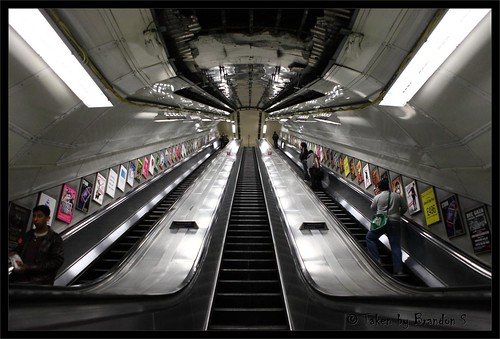
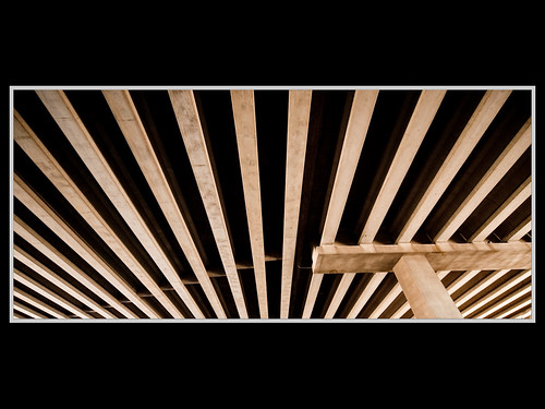
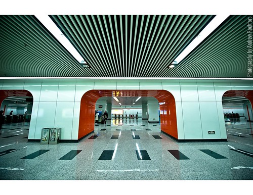
The lines on the ceiling in the image above create a sense of depth and it can suggest that the room is deeper than in reality.
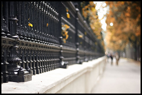
Lines can be used as a texture or they can be used to create volume. As a photographer I always love to use the depth of field next to a fence to accentuate the depth even stronger for a powerful and interesting result
D. Dominance, subject, hierarchy
even if the last item in this article, I believe that any composition should have a dominant presence that needs to be very clear. Just like in food when every dish has a dominant taste, any visual composition should combine elements in harmony to outline the main core of the subject. most of the images will employ of common sense and the subject is clearly shown , however I just wanted to highlight that sometimes it is difficult to understand the intention of the photographer and that is “what not to do for sure”
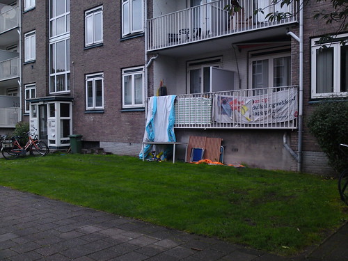
The image above is not clear to me what it is about. It is about the towel hanging over the balcony? It is about the building, it is about the bicycle? The intention is not clear and the composition is confusing – if there is an intention to show something, this is poorly done
In the image above, there is no doubt that the subject is the church and the fence is used to draw our eyes to the subject. This is a well defined composition with the clear intension shown and no confusion of what we see. Even if it attempts to use the rule of thirds, and the composition is somehow balanced by the presence of the tree on the right, the image could be classified as an composition with intent. It is also a good example as the church dominates the image without being out of scale allowing the other elements to complement it.
Conclusion:
Good composition are always the simple ones, wither following one rule or more. As a photographer, keep in mind and think what do you want to tell your viewer and how to say it to make it very clear. That will bring value to your images and make your works easy to read.
If you would like to submit an image for comment, please send us un email and we will upload it for public comments
The post Photography composition basics appeared first on Academy of Photography.
